Overview
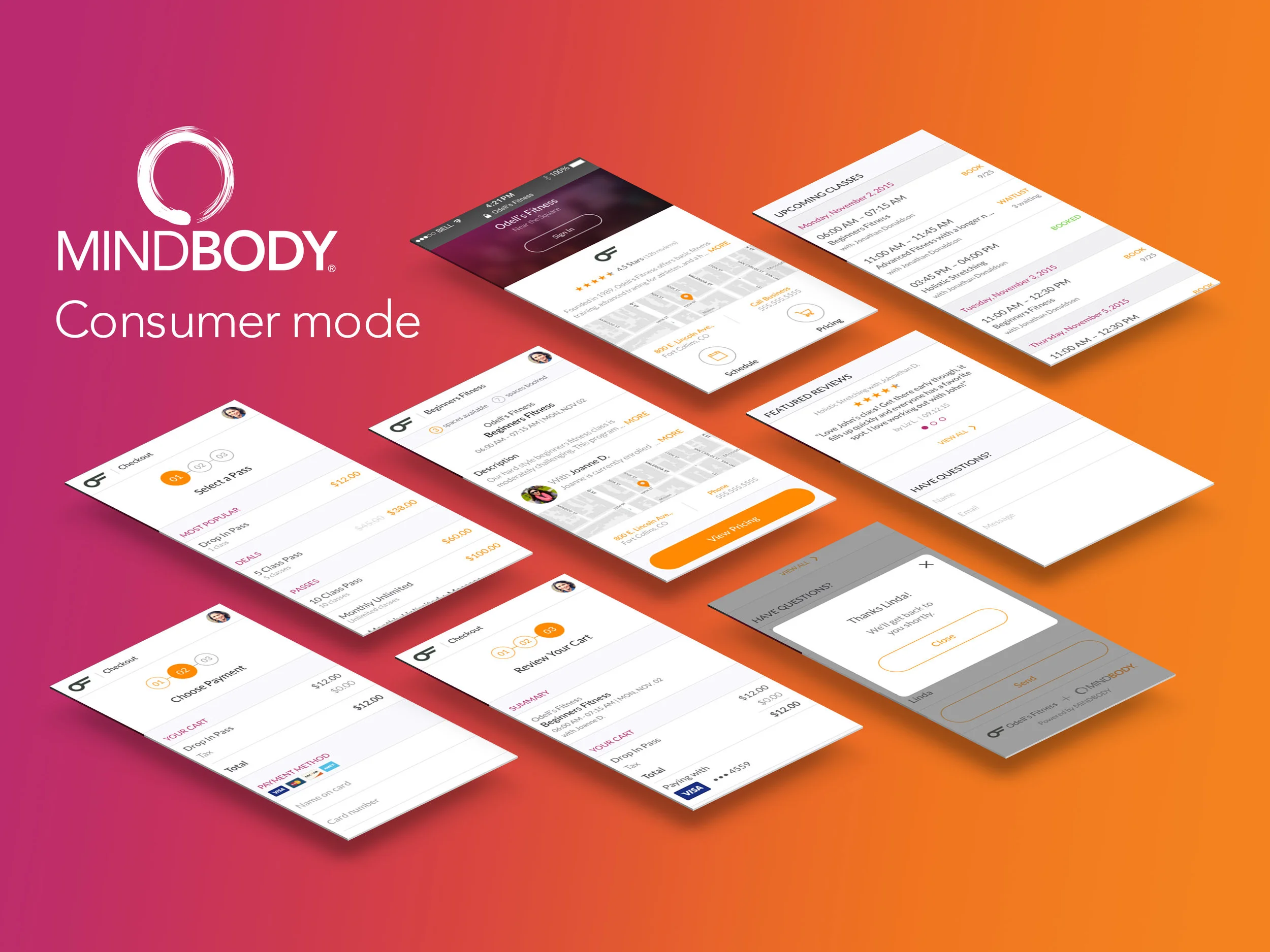
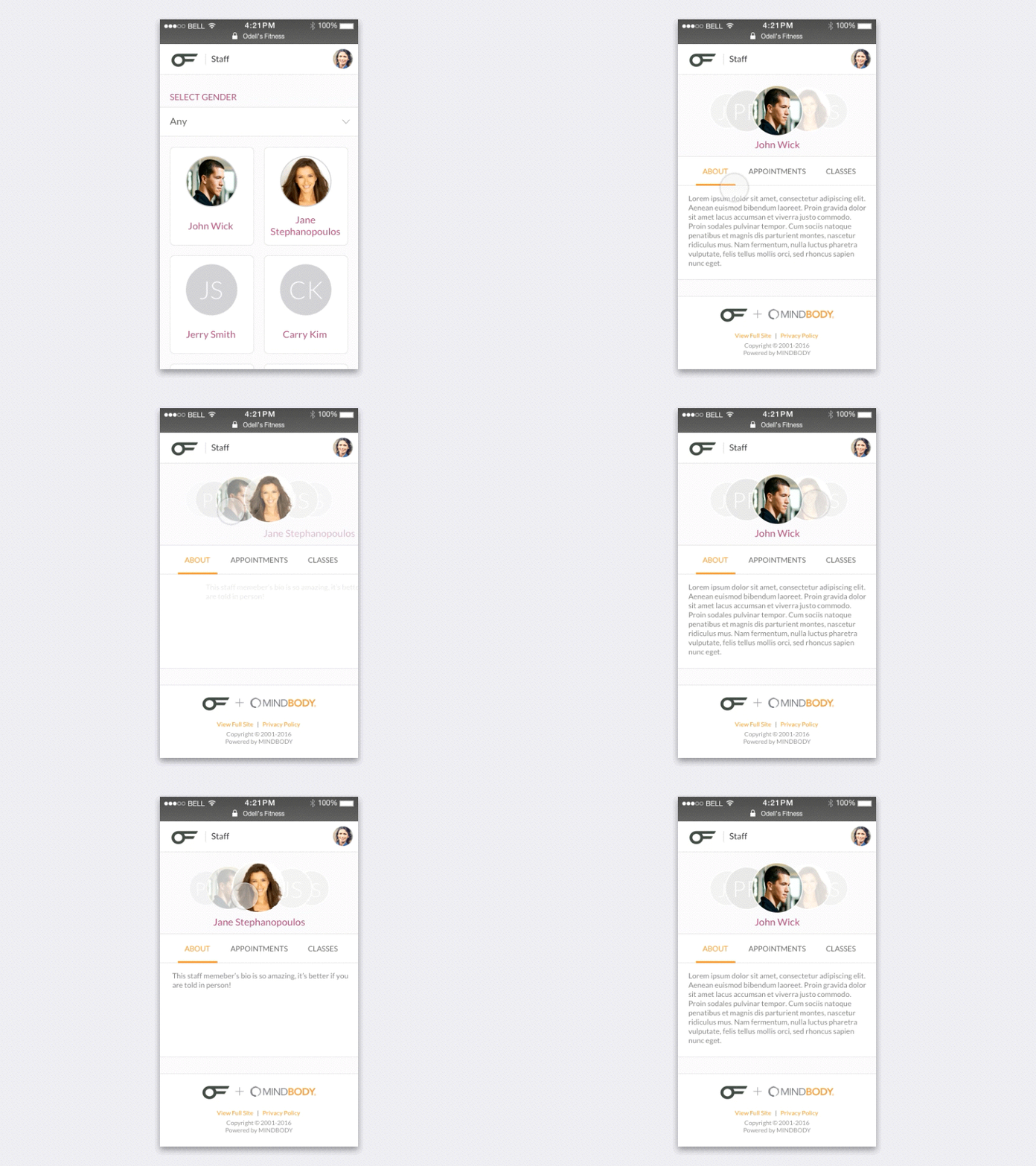
Lead designer for MINDBODY's mobile friendly online consumer mode. I was tasked with designing over 100+ screens for phone and tablet with key functions that included business details, class and appointment listings, staff profile, reviews, booking and shopping cart. My time was mainly spent in Sketch and Invision mocking up the UI for each screen. I also used Principle to build animations for browsing and purchasing. I worked closely with my art director and a team of developers to execute the project. The goal was to design an intuitive and delightful process for consumers to explore, find and book on their mobile browsers.
Old Consumer Mode
Below is the old consumer mode customers would use to book and pay for a class or appointment. It isn’t mobile friendly and very cumbersome to browse and select what service you would like.
The Redesign
Login
When a customer lands on the business’s consumer mode site they’ll be taken to this mobile friendly login page. We also included a function where they would be notified that a universal login would be activated for them. This is important because the customer can use one login for any business that uses MINDBODY software.
Business Page
After successfully logging in the customer is taken to an overview page of the business. Here, they can quickly browse through schedules, reviews, and learn more about the business.
Full Schedule View
This view allows the customer to view the business’s full class and appointment listings. You can also easily apply filters to see classes at a particular time or availability.
Class Description
After selecting a class the customer will be taken to a class description page. Here they can read more about what the class offers and a bio of the instructor. They can also book the class from this page.
Checkout
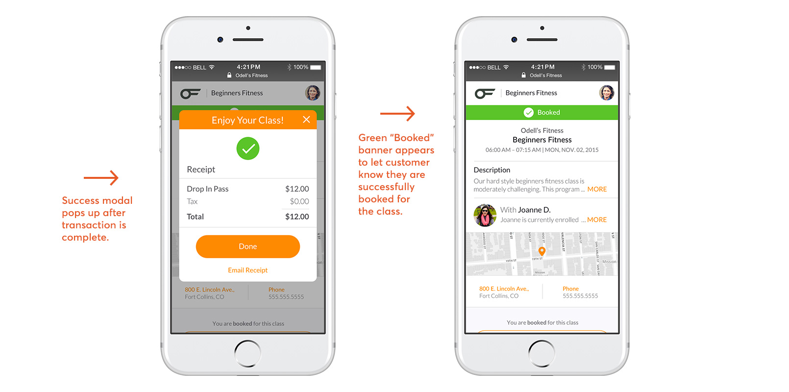
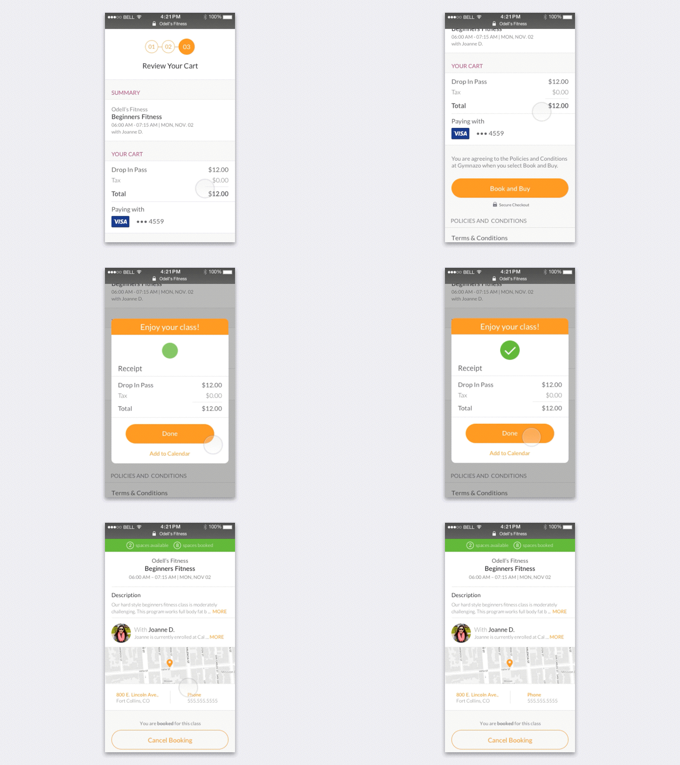
After the customer picks a service they would like to book they would be taken to the checkout page. We added a simple step counter to guide them through the checkout process. Here they can select what pass they would like to purchase, add payment method, and review what is in their shopping cart.
UI Animations
Below are some animations I explored to help visualize the user experience. This was one of my favorite parts of the design process. I love when I get to build animations to help guide the user and communicate exactly what needs to be shown to them. It’s also an opportunity to delight and surprise them.
Style Guide
What I Learned
Working on this project taught me how to build an experience where a customer could easily find, book and pay for a wellness service. There were many things to consider including price, class/appointment type, time, reviews, bios, and easy checkout. I learned so much with my fellow UX designers, copy writers and UX researchers. Working closely with the UX researchers taught me so much about the customer and use cases. Language, color, and animation are also so important when guiding a customer through a process like this. Overall, I’m proud of the experience we built.


